









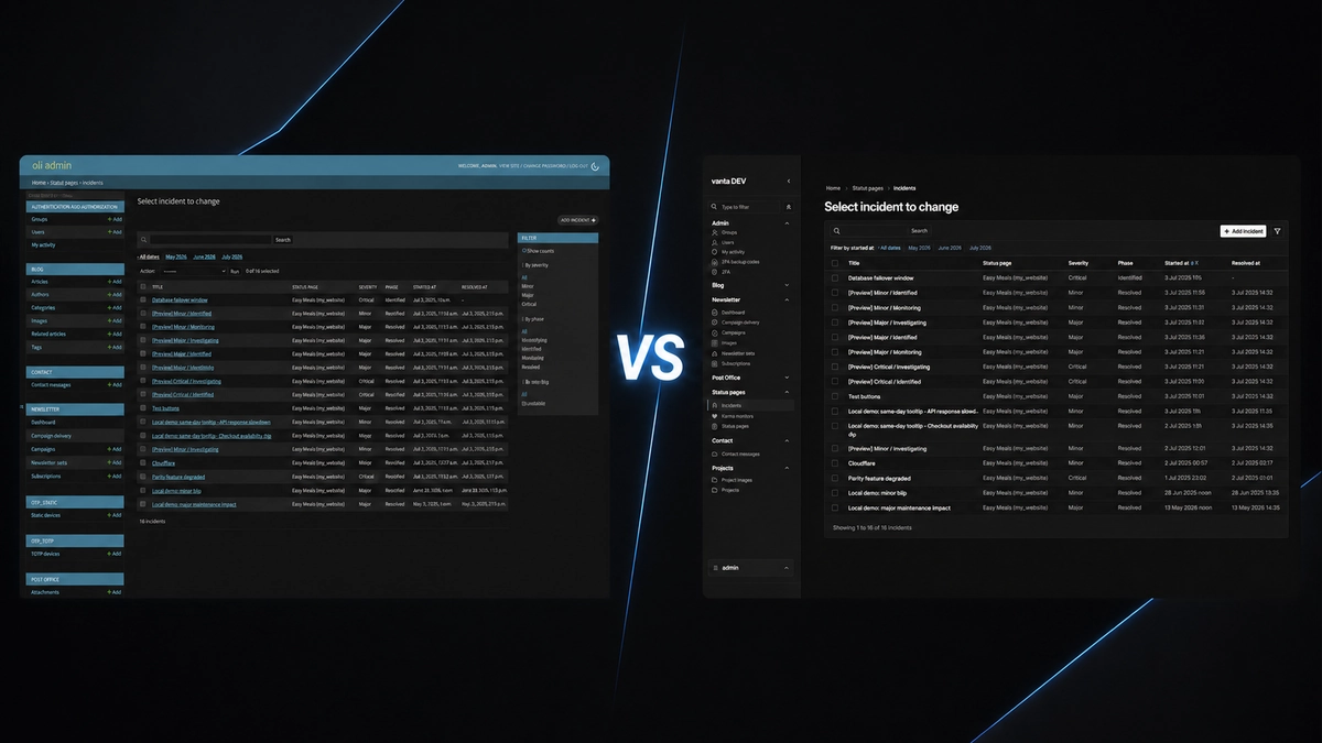
If you are comparing Vanta Admin with the default Django admin, the short answer is simple: Vanta changes how the admin looks and feels, while Django still does the work underneath. Your models, permissions, forms, and familiar admin workflows stay in place.
The main thing you notice is the screen you work in every day. Vanta changes the navigation, spacing, colours, tables, forms, messages, and smaller-screen layout so the admin feels more focused and consistent.
What actually changes?
Vanta Admin is a theme for Django admin. That means it sits on top of the admin you already know instead of asking you to build a separate back office.
The main changes are visual and practical:
- The overall shell gets a darker, more deliberate look, with light and dark modes.
- Navigation moves into a focused sidebar with app sections, icons, and controls that can remember your preferred state.
- Tables, filters, forms, buttons, breadcrumbs, and messages get a more consistent layout and spacing.
- Smaller screens get a mobile sidebar overlay instead of a desktop layout squeezed into a narrow window.
Those changes can make the admin easier to scan, but they do not turn it into a different kind of application. You are still using Django admin.
The biggest difference is the screen in front of you
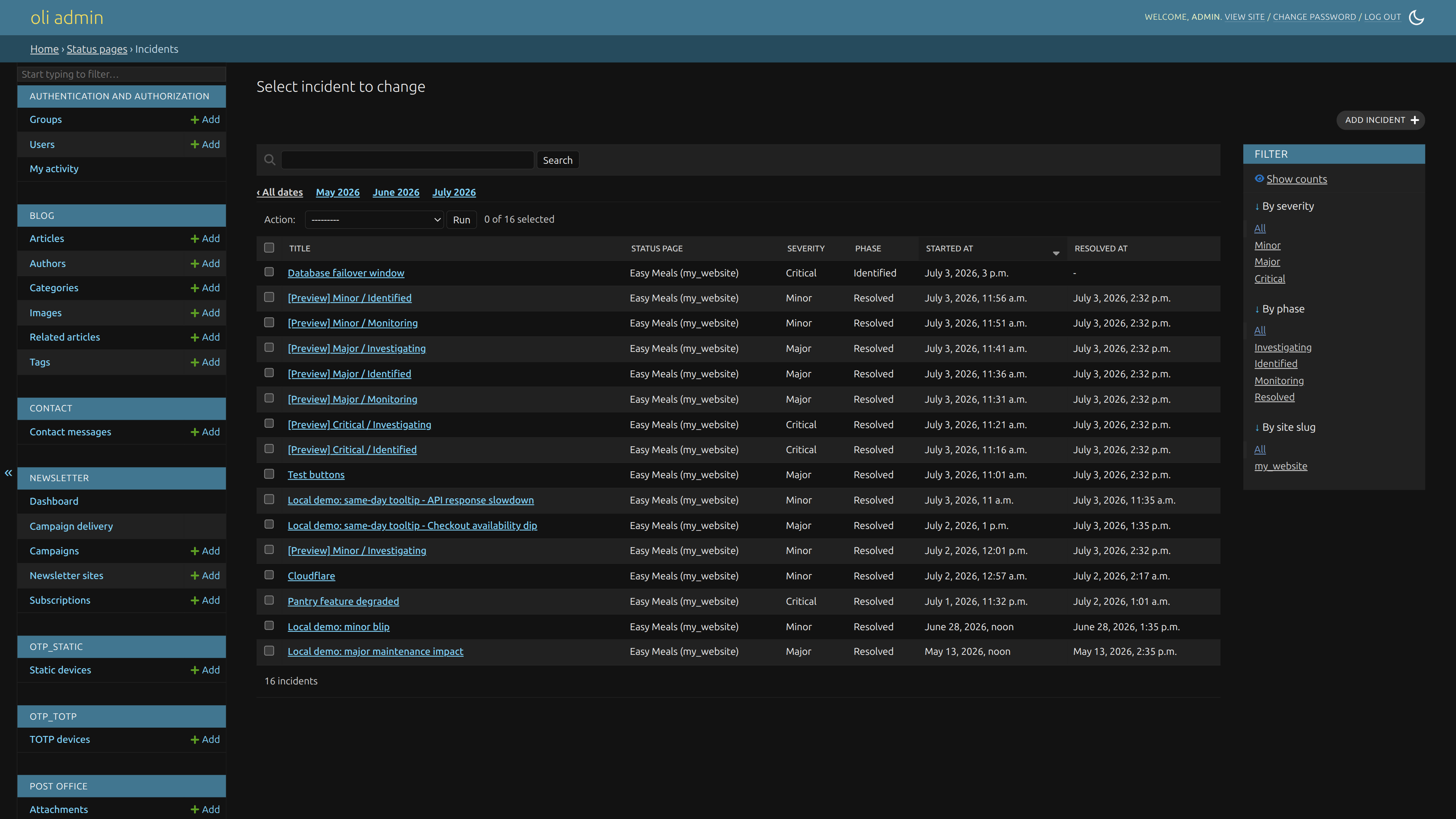
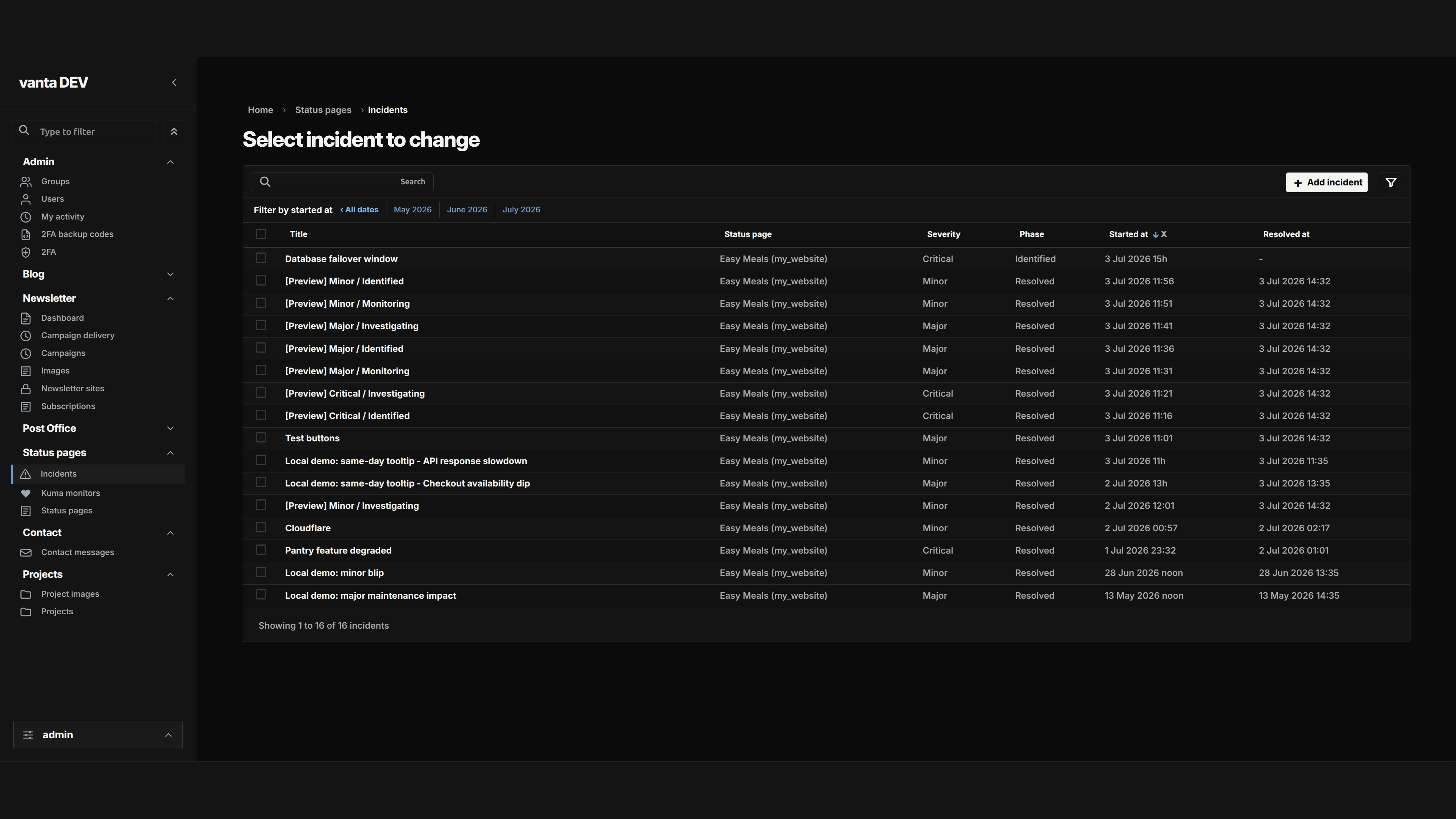
The default Django admin is intentionally plain and familiar. That is part of its strength: it gives you a useful model-based admin with very little extra to think about.
Vanta keeps that foundation but gives the screen a stronger visual system. The sidebar, content area, breadcrumbs, status messages, tables, and forms are designed to feel like parts of one product. The result is less about adding new business features and more about making the existing work easier to read.
Navigation feels more deliberate
Both versions show your apps and models, but Vanta gives that list more room to behave like navigation. Its sidebar can be collapsed, resized on desktop, and opened as an overlay on smaller screens. App sections can stay open between pages, and the navigation can be narrowed with a filter when a project has a long list of models.
That matters when you use the admin every day. You spend less time looking through a long page and more time getting to the model you need. The default admin remains a good fit when a simple list is all your project needs.
Tables, forms, and messages still do the same jobs
Vanta changes the presentation of common admin screens without changing what they are for. A list page is still a list of objects. An edit page is still a Django form. Filters, save buttons, validation messages, history, and delete actions keep their familiar purpose.
The Vanta version uses tighter spacing and clearer visual states to make those screens easier to scan. Selected rows, filters, form errors, buttons, file inputs, and success or warning messages get a consistent treatment. You do not have to learn a new content system just because the pages look different.
Many-to-many fields get a clearer redesign
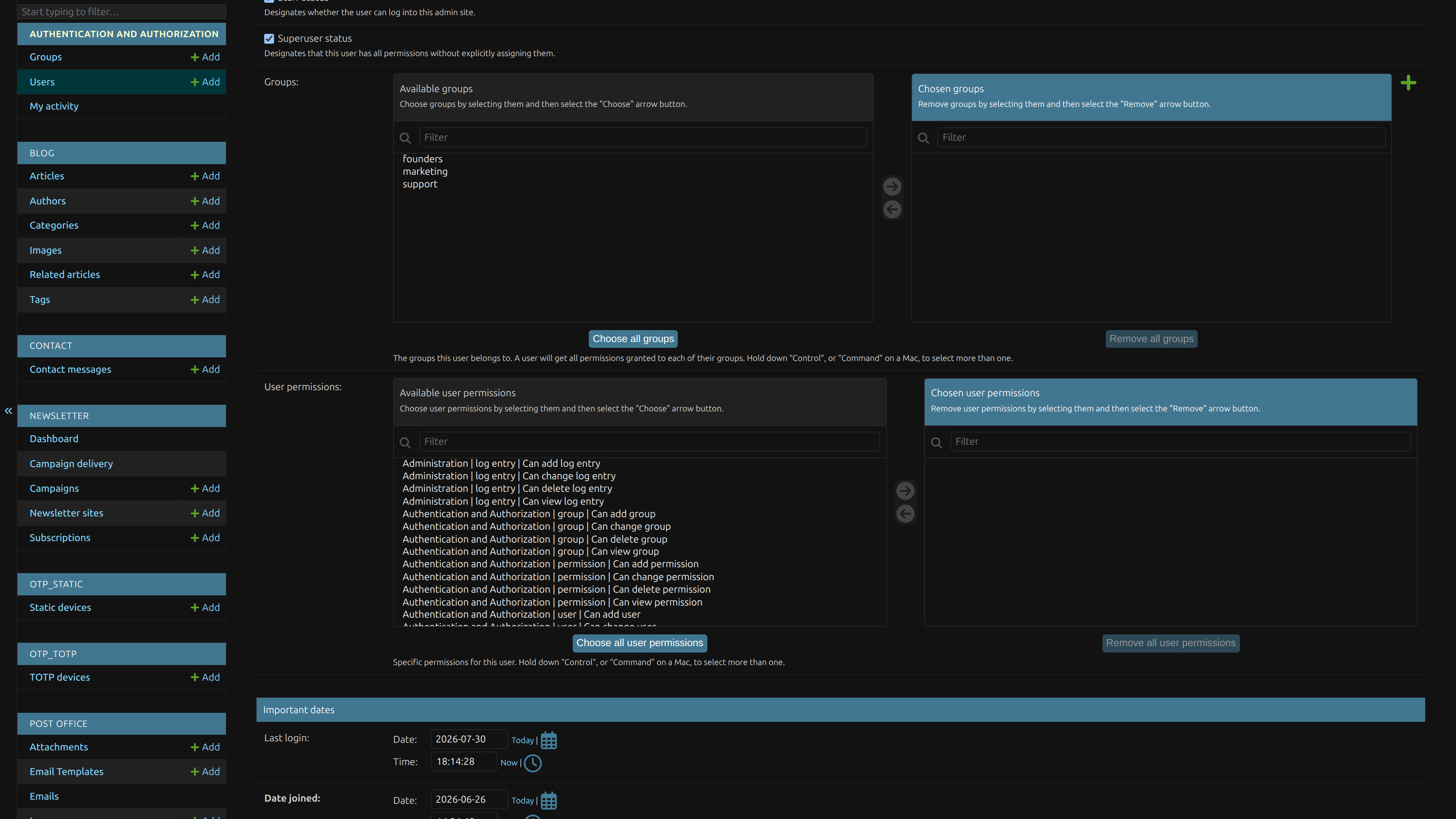
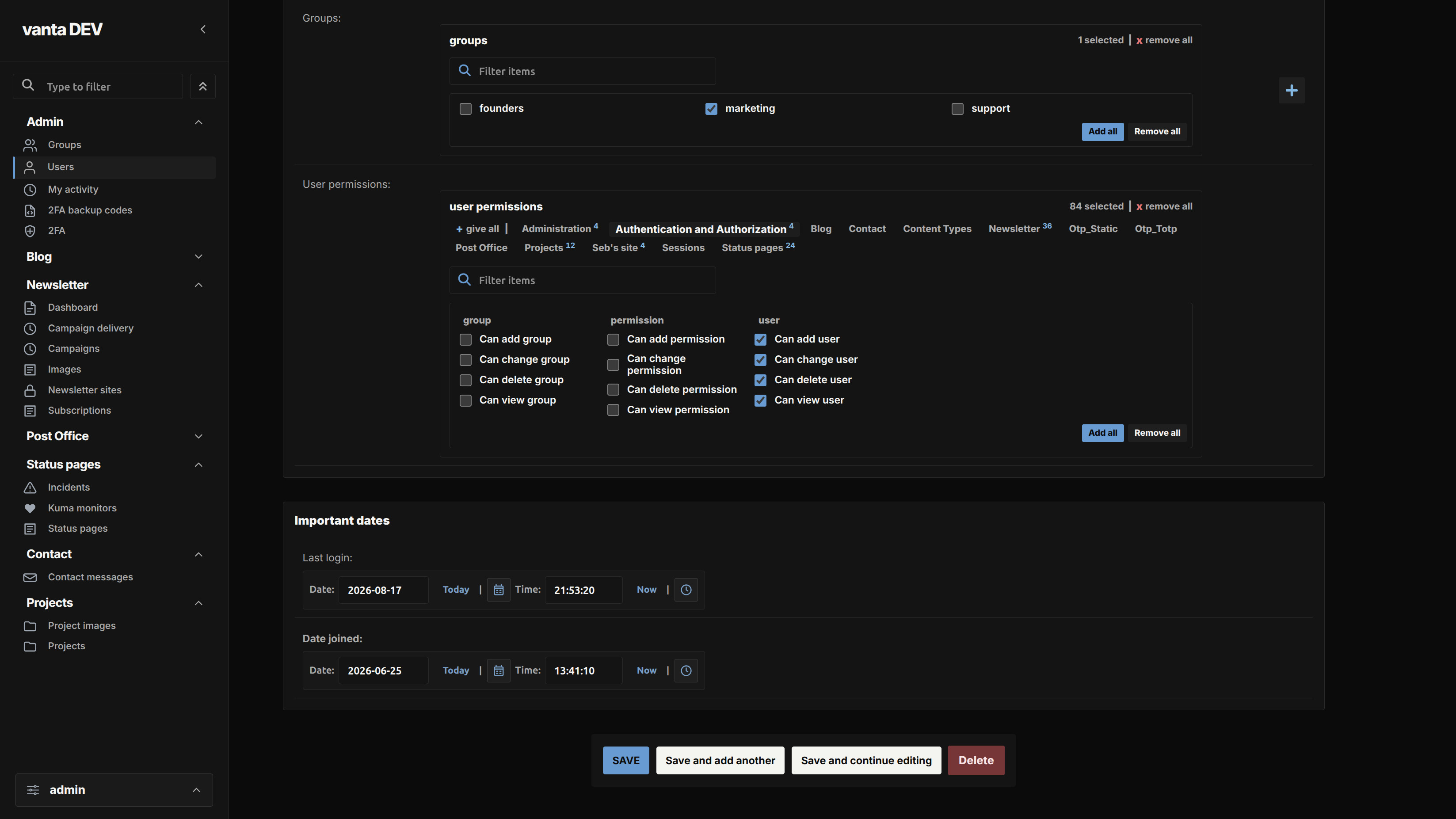
Many-to-many fields are useful when one record can be connected to several other records. In the default Django admin, a long list of available and chosen items can work, but it takes space and becomes harder to scan as the list grows.
Vanta gives this part of the form a more focused layout. You can filter the items, see selections grouped in a way that is easier to follow, and use clear add-all or remove-all actions when that makes sense. In the permissions example, the groups and counts make a large selection much easier to understand at a glance.
This is one of the Vanta changes I am particularly proud of. It does not change what the field does. It makes a familiar Django form feel much more manageable when there are a lot of choices.
What does not change?
- Your registered Django models and admin pages
- Django's permissions and staff access rules
- The server-rendered Django admin foundation
- The normal flow for viewing, adding, editing, and deleting records
- The data and business rules owned by your project
Which one should you choose?
The default Django admin is a sensible choice when its plain layout works for you and you want to keep your project as small as possible. It is already useful, familiar, and closely tied to Django itself.
Vanta Admin makes more sense when people spend a lot of time in the admin and the standard presentation feels harder to scan than it should. You get a more focused layout, stronger visual consistency, light and dark modes, and a better approach to smaller screens while keeping the Django workflow underneath.
I would start with the default admin for a small project, then add Vanta when the daily experience becomes the problem. A theme should earn its place by making real work clearer, not by adding decoration for its own sake.
Django admin documentation Official documentation for Django's built-in model-based admin and its customization options.
Vanta Admin project Project details, installation notes, and the boundaries of the theme.